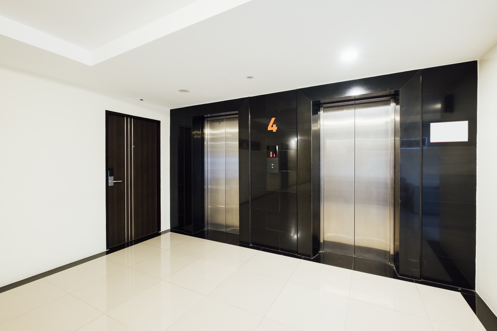
Ever pressed an elevator button and got in only to realize it’s going in the opposite direction of where you want to go? Congratulations, you have just experienced bad UX design in real life.
See the thing is, you don’t call an elevator towards you. You tell it where you want to go (Up or Down) from the floor you are in. But because the buttons are in front of you without any context, people assume they are “Summon” buttons instead of “Selection” buttons. That’s a design fail, not a user fail.
So how do you solve the elevator problem?
- Write a label “Where do you want to go?” above the buttons to guide users to make it clear that the user is supposed to choose a direction.
- Add a single “Call elevator” button. Though this is not a very optimized way in case of multiple elevators on the floor and would lead to increased crowds.
- Replace buttons with a touch screen on each floor asking “Which direction do you want to go?”
- Give feedback after pressing analog buttons showing “You want to go down. Sending elevator now.” This reinforces that the button is for selecting direction and not to summon the elevator towards you.
Life is full of these little UX misunderstandings. Here are 14 more things that are designed terribly but make you feel you are the problem.
- ATM cards that don’t tell you which way to insert the card. A simple sticker on the machine would save millions of cumulative wasted minutes.
- Office printers that have the actual print button hidden inside the 3rd tier menu. Why not keep it simple and start from the user intention? Just give the “Print” command on the home menu and design a user journey from there, passcode and everything.
- Some buildings label the ground floor as 0 while others start from 1. Standardizing this as a policy would lead to lesser confusion.
- Seat recliner buttons in airplane / trains and cars are placed depending on the manufacturer. Some buttons are on the left bottom, some on the right below the hand rest. Some seats have 2 buttons beside each other to position the seat and recline.
- TV remote is overloaded. Do you really use 50 buttons for your television? The physical remote can even be designed for circular navigation which opens / closes depending on the tier 1 button press. Or keep it simple with 5 buttons and display the submenu navigation on the television itself.
- Bluetooth pairing that never works on the first try. You disconnect, connect again and them it somehow “catches” and pairs. This might be because of interference, pairing data conflicts, incompatible bluetooth profiles and more. Visual or audio feedback to tell us what the issue is would really help.
- Volume buttons on your phone that also change notification sounds. I just want to lower my music, not mute my alarm for tomorrow.
- Email unsubscribe buttons that make you log in first. Would’t the user just mark you as spam and move on?
- You pull the left handle of the tap water mixer and it’s too hot, you pull the right one and it’s too cold. A temperature sensor and indicator which shows the current water temperature would be nice for user feedback.
- Toaster with no visible timer. Am I getting burnt bread? Who knows. Even a mechanical winding timer would work.
- Smart home devices that require an app for basic functions. Why not use voice or touch commands for basic functions instead of forcing the user to download the app for switching on the light?
- Delivery tracking pages that don’t update for days. Is my order lost in a fire somewhere? You can reduce user anxiety by simple training your logistics team to follow a SOP and update the app at rach stage of transportation.
- E-commerce websites that let you add to cart but say “item not available” at checkout. Unless the last item in your inventory was checkout out by someone else in the time I got to the checkout, it might just be that your frontend page doesn’t have bi-directional communication with the server and cannot update the availability status in real time based on available inventory.
- Trains that don’t tell you which side the the upcoming station will arrive. Time to guess and hope you are right. Or ask someone standing beside you and trust that they are right.
UX can help make your life easier, or make you feel like an idiot. Noticing and fixing the little things in your own product is always a pursuit that your users will thank you for.
What’s the worst UX fail that you’ve ever encountered?